EventHQ Connect & CheckIn
Bridging the gap between planning and live event experience.
Overview
As EventHQ grew into a full event ops and intelligence platform, we faced a big question: what happens the moment an event actually kicks off?
That’s why we built Check-In and Connect, two lean apps designed to tackle the chaos of live event logistics and keep everyone connected.
Check-in took care of smooth, speedy entry. Connect made sure the event experience kept flowing after the doors opened.
My Role
I owned product design for both apps, defining how users move through the check-in line, how organisers get real-time updates, and how attendees stay engaged.
From quick guest approvals and walk-in surprises to post-session feedback and sponsor lead capture, I focused on keeping things simple, fast, and stress-free.
Part 1: EventHQ Check-In
The problem
Before Check-In, organisers were juggling Excel sheets, pre-printing thousands of guest ID cards, and spending precious time searching for attendees at the gate. Manual lookups caused bottlenecks, long lines, and frustrated guests.
On top of that, last-minute walk-ins, missing tickets, and payment confusion meant chaos at check-in volunteers had no clear way to manage approvals or quickly update guest status.
Many used paper lists or fragmented tools that didn’t sync with their event data, making it impossible to get a real-time picture of who was inside.
What we built
Quick QR & face-scan check-in
Guests zip through by scanning a QR code or their face, no fumbling with lists or paper tickets.
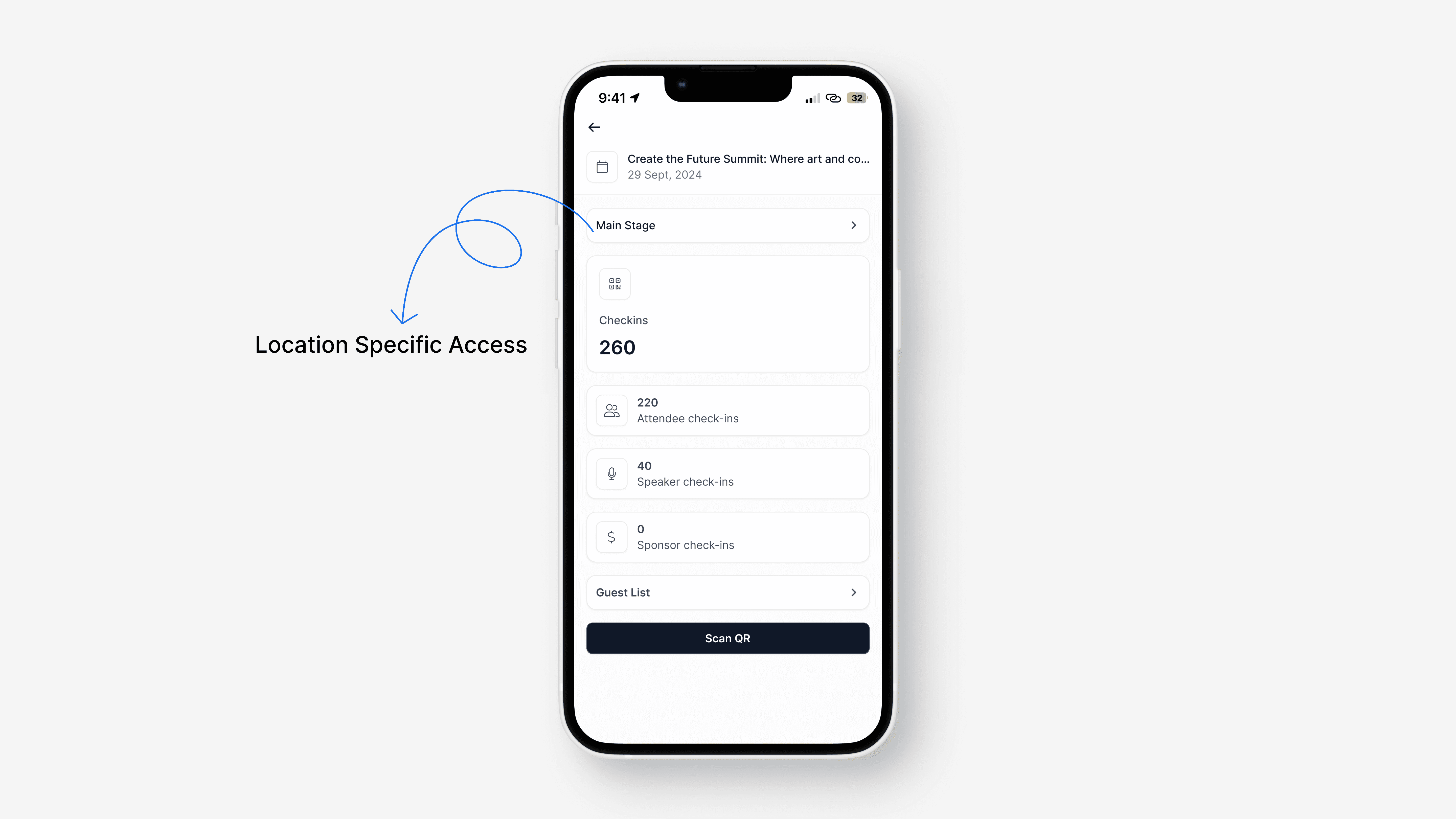
Multi-device sync
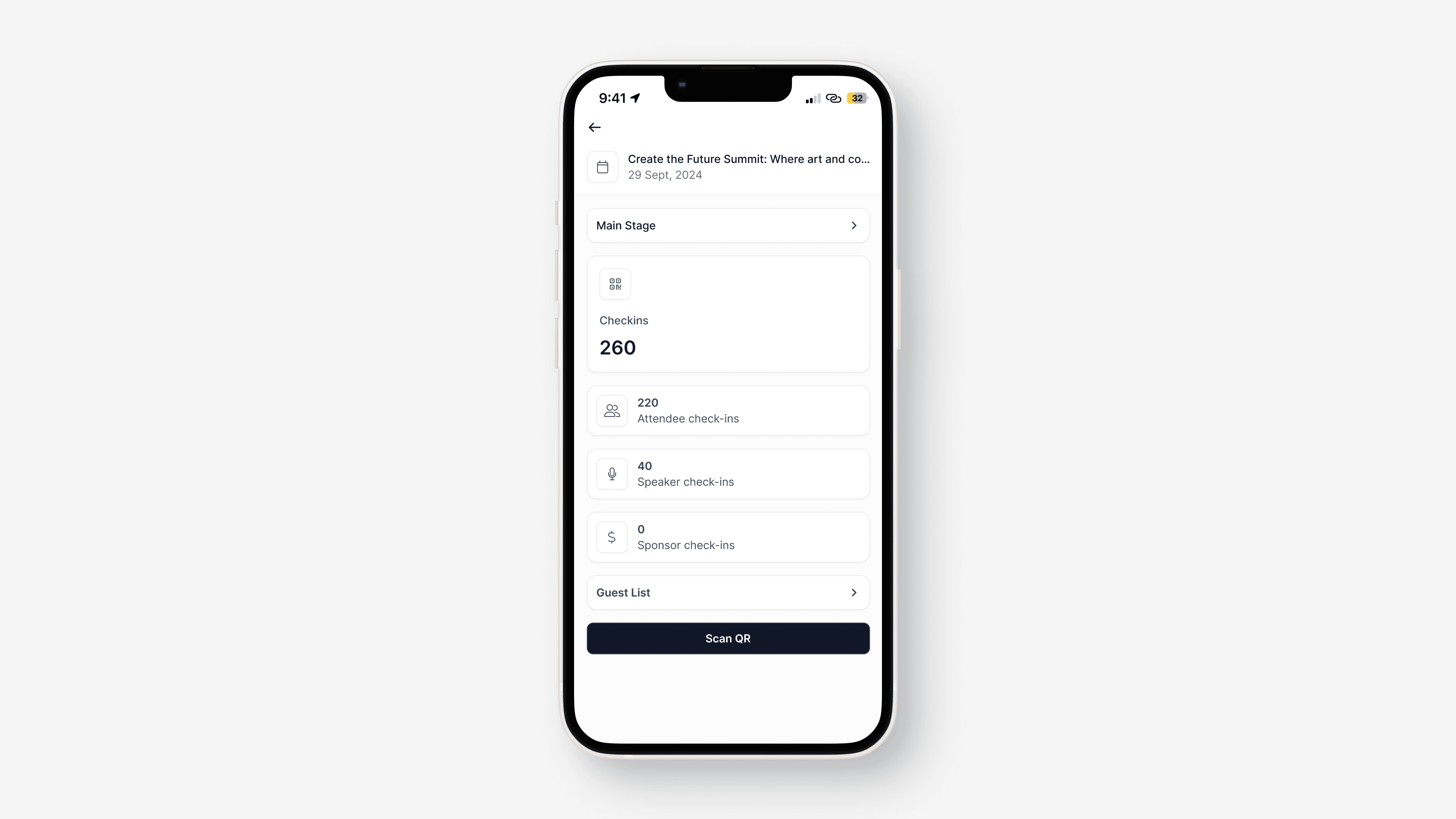
Whether staff were at multiple doors or session rooms, every check-in was updated live across all devices.
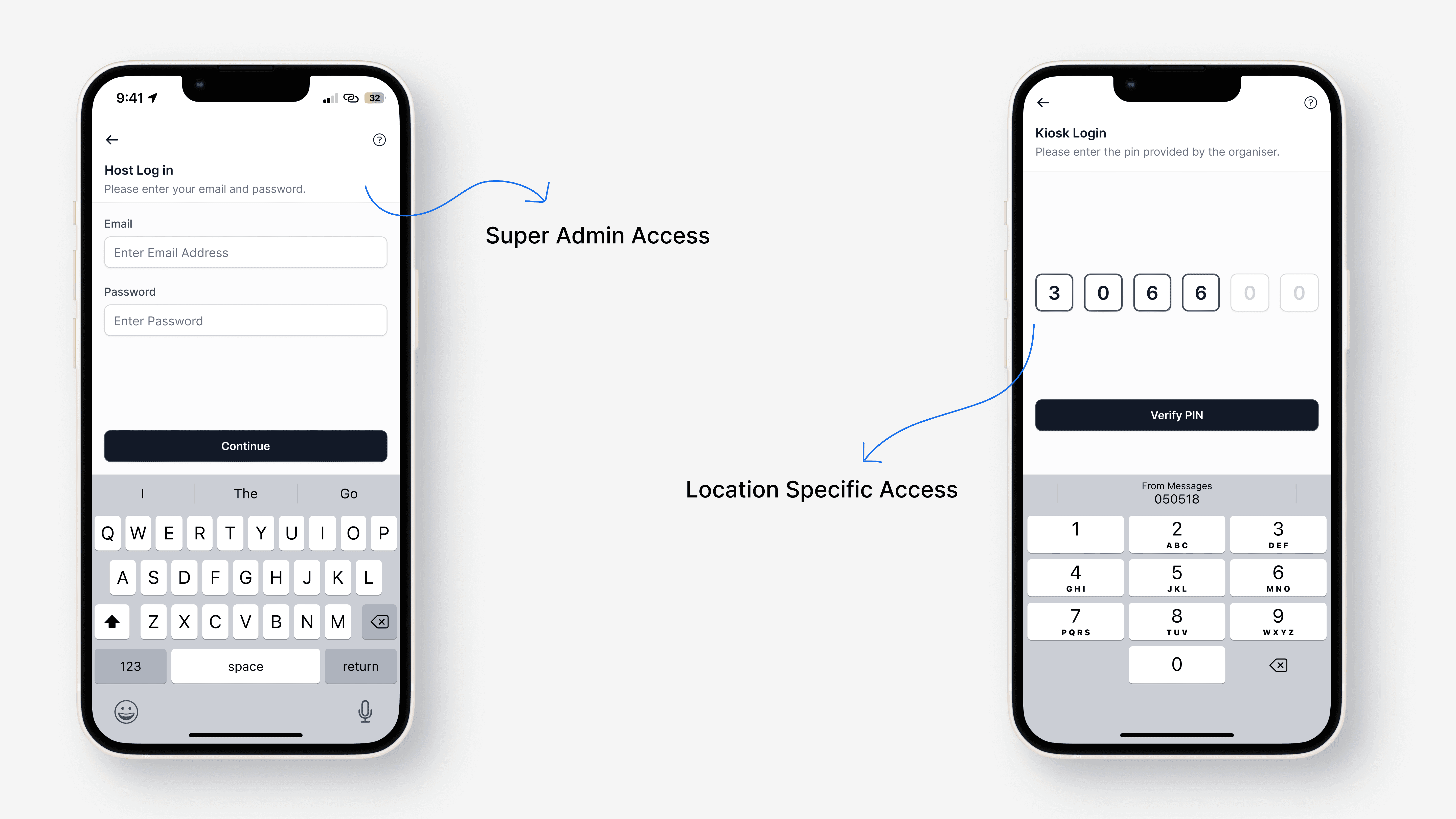
Self-serve kiosk mode
For busy venues, guests could check themselves in without staff, speeding up the whole process.

Offline-friendly
Spotty Wi-Fi didn’t slow things down; check-ins queued and synced as soon as the connection returned.

Design process & thinking
The core goal was to get people through the door without a hitch. We designed around the realities that event teams face, from multi-gate check-ins to last-minute walk-ins.
Our design process started by mapping key pain points: slow manual lookups, confusing guest statuses, and uncoordinated devices. We used rapid prototyping and iterative user testing to create flows that felt natural, even under pressure.
We focused heavily on clarity, bold statuses, large scan areas, and instant feedback so volunteers never had to second-guess the next step.
Key strengths and metrics
Guests check in and print badges in under 10 seconds on average, even during peak times.
Multi-device syncing keeps every team member on the same page in real time.
Offline mode means spotty internet doesn’t bring operations to a halt.
Kiosk mode lets guests self-serve, reducing bottlenecks.
Our UI prioritises information density without clutter. Compared to competitors, our interface is cleaner, more intuitive, and tailored specifically for event-day urgency.
Part 2: EventHQ Connect
The problem
Sponsors and teams at events used to carry stacks of physical business cards, jotting down leads on paper or spreadsheets. This led to duplicate entries, lost contacts, and no real way to attribute leads properly.
Sponsors had to manually enter data later, wasting time and often losing valuable context about where and when the connection happened.
Organisers struggled to coordinate between teams collecting leads and couldn’t track if target guests were being engaged. Information lived in pockets, slowing down follow-up and hurting ROI measurement.
What we built
Instant check-in alerts
Sponsors and organisers got notified when VIPs, speakers, or prospects checked in, so they could connect in the moment.

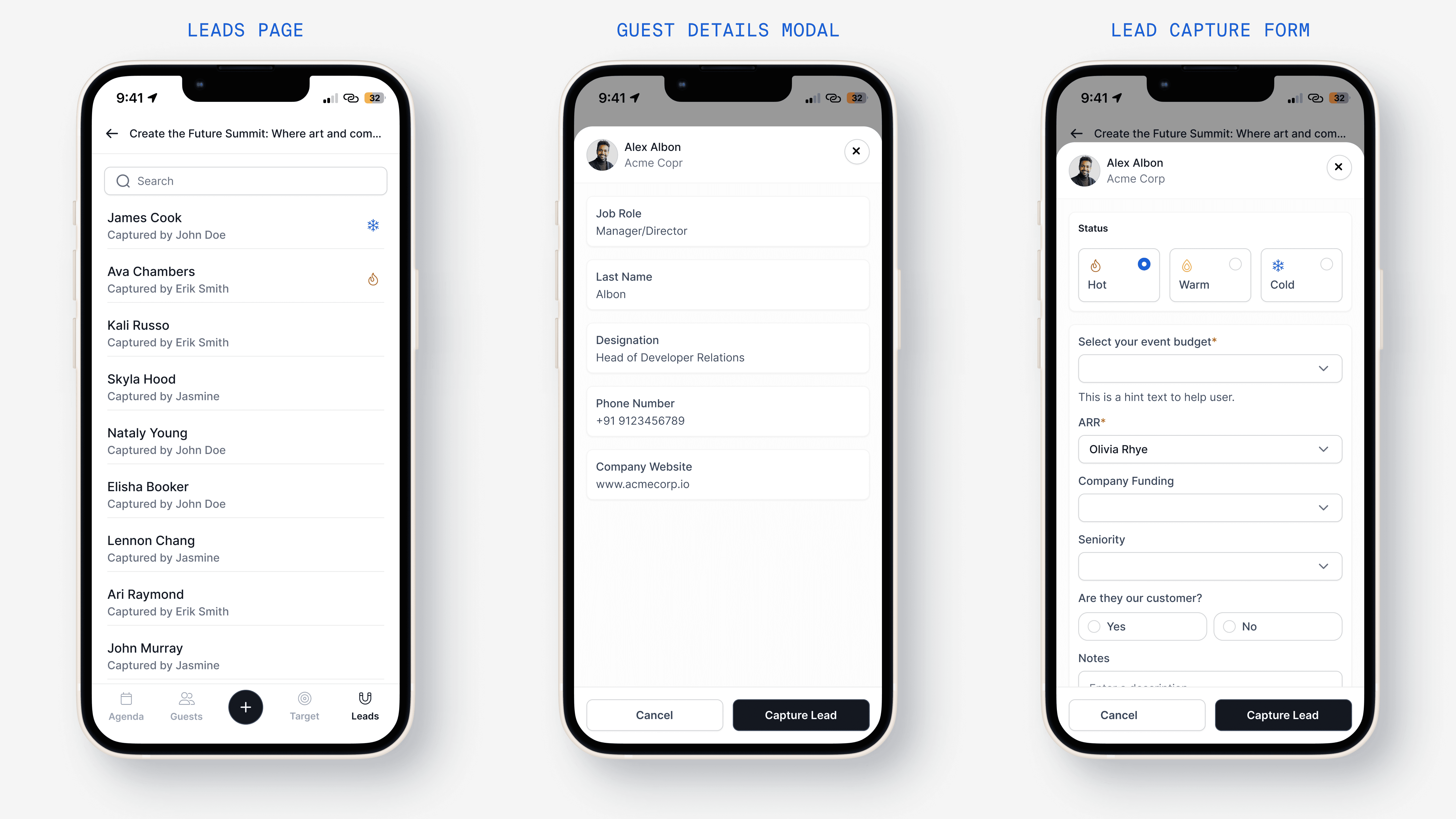
Lead capture for sponsors.
Sponsors could scan badges or enter visitor info, enriched with EventHQ guest data for better follow-ups and accurate lead attribution.

Target list tracking
Create target lists in EventHQ that sync with the app for real-time tracking. The app shows if a teammate has already captured a lead, avoiding duplicates and keeping lead info organised.
Real-time session feedback
Attendees could rate sessions and leave feedback right after they ended, giving organisers immediate, actionable insights.

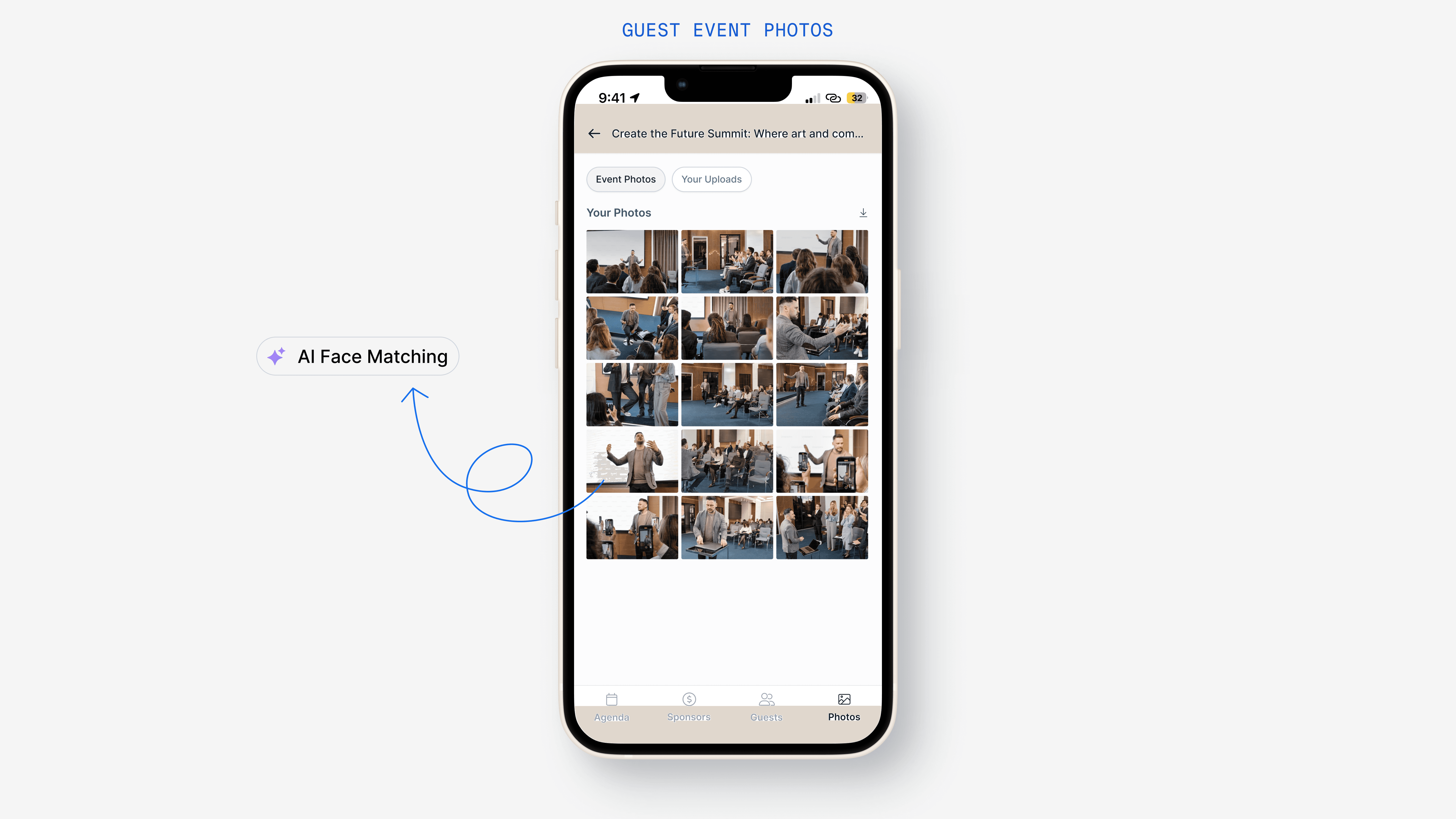
Face-scan photo access
Attendees simply upload a selfie and get instant access to all their event photos, no digging through albums or waiting for emails.
Design process & thinking
Once guests were in, the challenge was to keep them engaged and provide sponsors and organisers with live insights.
We designed Connect as a lightweight, task-focused app that cuts through noise and delivers only what users need: instant photos, feedback, lead capture, and check-in alerts.
We put a strong emphasis on seamless data sync and minimizing steps. Sponsors, for example, no longer needed to juggle physical cards or spreadsheets everything happens in-app with real-time updates across teams.
Key strengths and metrics
Sponsors capture leads digitally, reducing duplicates and improving follow-up accuracy.
Attendees access photos instantly with face-scan, boosting engagement and social sharing.
Session feedback rates rose by 35% thanks to timely prompts after sessions.
Real-time check-in alerts improved sponsor outreach speed, increasing meaningful connections.
The Connect UI was built to be distraction-free but powerful, focusing users on actions that drive ROI and attendee satisfaction.
Final thoughts
Together, Check-In and Connect closed the gap between planning and live event delivery. They didn’t just extend EventHQ, they completed it.
And most importantly, they worked. When the doors opened and the buzz started, both apps were ready to keep the event moving no fuss, just flow.